Wednesday, December 05, 2007

POlAND


Piotr C. of Poland submits this foreign language case of typographically inconsistent (but not entirely confusing, since the CAllAN L's are taller than the other letters) lowercase L usage:
Recently I visited the part of Warsaw I'd never been before. It was late in the night and we were waiting at the bus stop for the bus to come. And than I saw this poster, which was advertising some language school. When I saw its title I immediately recalled your blog.

The title says: "Caiian Method". It looks a lot like Hawaiian ;) But they obviously meant "Callan Method" and apparently those lower case L's in the middle seem to have their shape for aesthetic purposes (but still typographically incorrect).

Further writing states: "English 4 times faster", "Attention! New! Only with us!", and so on.

I like the speaking Pacmen!

Friday, November 23, 2007

Please RECYClE


Supposedly I live in one of the most desirable neighborhoods in Brooklyn, but some of my fellow Park Slope neighbors don't seem to be living up to our reputation. Take this 6th Ave. sighting of the Recycle bin. Sure, it's just trash, but even the hot mommas in this neighborhood put on a little makeup and dress to impress when they go to the grocery store. I expect no less from our PlASTIC and GlASS bins, especially if the author is going to take the time to write the i's so capital they resemble uppercase T's.

Thursday, November 22, 2007

Off-COlOR

Walk-ins may be welcome here, but this off-COlOR sign may result in a few walk-outs. Found by Grant H. in Austin, Texas, this is a perfect example of the lowercase L enigma -- the L in COlOR is the only lowercase L on the board, while all the other letters, including all the other L's, are uppercase.  I'd call the number on the sign to ask, but those 1's might be lowercase 7's.

Tuesday, November 20, 2007

COllEGE

Our readers are training their offspring to carry on the lowercase L mission! This one was spotted last spring outside Northeastern University in Boston by Jackie, daughter of contributor and fellow nitpicking blogger Bob H. of Why a Tittle.  As with many signs, the author passed with ONLY one uppercase L, but didn't make the grade in COllEGE.

Wednesday, October 31, 2007

HAPPY HAllOWEEN!

Melanie of Sammamish, WA writes,
I have been reading your blog for quite a while now which has kept me on the lookout for lowercase ls. I didn’t think that I would ever find one… until tonight. I almost caused a traffic accident because I was so excited about the find! I guess the marquee poster decided that this (pictured) would look less weird than HALlOWEEN lOCK IN. I think that I agree.

HAPPY HAllOWEEN!

Sunday, October 28, 2007

HAllOWEEN INITIAlS

Lowercase L reader Mandalyn found this fun Halloween Monster Initial Stickers Name Generator that spells your name out using monster picture letters. She noticed that her name was generated as MANDAlYN and notified me immediately. Turns out the L font was the only lowercase letter, for some reason. They've since fixed it, but I was lucky enough to generate this classic lOWERCASE l monster sign before they caught the error. Scary!

Sunday, October 21, 2007

SMAll Problem

The SAlMON didn't bother me so much on this downtown Manhattan menu, since the author at least tried to make the lowercase L taller than the rest of the uppercase letters. But I did have a small problem with the SMAll soup size, once I got past the odd "toDAYS", that is. This SMAll isn't the first, either. Check out the SMAll Chinese take-out, and the SMAll Coffee, too.

Wednesday, October 17, 2007

TIllMAN

This may be a tribute to the late Pat TIllMAN, who left his career as a football player to join the army and fight in the war in Afghanistan. He might be less flattered if he could see how his name was written on the back windshield of this truck that Stephanni in Abilene, TX caught, with the confusing array of long lines that looks like the Roman numeral III. Even the little dot on the i, which seems more like an afterthought, does not help very much.

Tuesday, October 16, 2007

PlAYING On The Bridge

There's more than just troubled water under the bridge in this fine lowercase L example, found by Nikki at Branch Mouth in San Ignacio, Cayo District of Belize, Central America. PlAYiNG on the Bridge is clearly not allowed, but apparently hiring sign writers with dysgraphia is. The author may have tried to balance the lowercase L with a lowercase i, but it's too little too late.

Monday, October 15, 2007

ONlINE

With the popularity of Facebook apps like Graffiti, it's not surprising that lowercase L's are beginning to surface in our virtual social networks. Submitted by "Gez", this simulated spray painted message to a ClASSY BITCH of a friend is doubly insulting with the neglectful lowercase L.

Similarly, here is a nice Craigslist personal ad for men seeking men in Portland, submitted by Johnny J.:

How can you trust people you meet online, especially if they exhibit carelessness in their usage of lowercase L's?

Sunday, October 14, 2007

FRAGIlE Situation

It's one thing when I find improperly used lowercase L's whilst out and about, but it's another thing when it's right in front of my building. Apparently my neighbor is not aware of the FRAGIlE balance between upper and lower case. I do appreciate that he tried making the lowercase L a bit taller than the adjacent uppercase I and other letters, as well as separating the corrugated cardboard for recycling. But this cardboard message just outside my building is like the bloody horse's head in the bed of my lowercase L world.

Tuesday, October 09, 2007

Fancy ClANCY

Friend, journalist and fellow blogger Paul of Englishman in New York is always trying to impress me because I am his hero in the world of blogging. His previous attempt to enter my lowercase L domain fell flat, but his latest contribution, almost a self-fulfilling prophecy, is quite nice. After his interview with top selling author Tom Clancy, Paul explains:
Hey William

If you ever decide to peer into the mind of a Lowercase L perp, I am afraid you may be sorely disappointed. Look what I just did.

I have no idea how it happened. I don't remember ever writing a Lowercase L before in my life. Maybe I have been reading your site too often? Maybe it's contagious?

All I know is that I wrote the uppercase "C" followed by the lowercase "L" with the full intention of continuing in lowercase letters. And yet for some reason my hand insisted on the uppercase.

It threw me so much that I even misspelled "EXPENSES" in the second word.

At some point in the future I am going to find this envelope and wonder who or what CIANCY EXPENCES are. How embarrassing.

Paul

Inspired by lowercase L, Paul also has a new photo blog — Look for Signs of Life!

Monday, August 27, 2007

BlOOMING L!

Finally, someone else on the scene in NYC helping to patrol the streets. Kyle found this BlOOMING good example in Midtown Manhattan, and opined, "A florescent poster board brighting the soulless corporate vibe of this dumb part of town." This is a peculiar example of lowercase L — it doesn't come across as a space saving technique, since there's plenty of pink paper to go around. And it doesn't really seem like the author forgot the L and squeezed it into BOOMING. Whatever the case, I'm tickled pink by this find.

Friday, August 17, 2007

Who the L are You?

Whoooooooo Are You? Who Who? Who Who? Lowercase L reader Gary C. found this rare The Who promo album from Japan, replete with spelling errors and letter case inconsistencies. Besides adding an extra D to Pete Townshend for TOWNSHEDND, we have not one, but two misused lowercase L's in ROGER DAlTREY and JOHN ENTWISTlE, making this rare album even more rare! Keith Moon, you may have died young, but you lucked out on this album cover, being the only member whose name was written correctly.

Monday, August 13, 2007

ClAY Achin'

Tammy found this ClAY POTS sign in Pamplin, VA, and explains in her blog:
I recently came across the blog lowercase l. Until reading a few of the entries, the case for lowercase l had not previously crossed my mind. However, while on my three day hiatus what did I happen to meet? Well, nothing short of my very first lowercase l sighting!!! I'm so excited that of course I had to share! Would you like to buy some lowercase l pot?

The author seems to have known in advance that he would run out of room and prepared by slipping in the lowercase L immediately after jotting down the first capital C. He should also be commended on his fancy kerning with the T in POTS.

Thursday, August 09, 2007

GRILlS Gone Wild

What do you do when you've got a bunch of GRILlS to unload, but you only have one uppercase L to make it happen? Found in Hudson, MA, Bob H. is back with the answer, which, of course, involves the substitution of uppercase i's for L's on this sign announcing "ClOSE OUT DFAlS". And what's the DEAl with DFAl? Did the lower part of the E fall off, or was there also an E shortage? This is the closest I've ever seen stenciled lettering look like the handwriting of a dysgraphia sufferer.

Sunday, August 05, 2007

On a ROll

Having been turned onto the lowercase L craze by his girlfriend, new blog reader Bob H. sent in two superb photos. This one, taken on East Main Street in Marlborough, MA, assures us that the "LOBSTER ROll IS BACK". Besides the deliberate use of uppercase i pieces in place of lowercase L's, this sign also stands out because of the unusual text alignment. It almost looks like the result of a text editor that spaces out sparse words to achieve both left and right justification. And the top words are each center aligned with the word below.

"Pizza & More"? I think we know what the "More" is. It's poor judgement in text assemblage on restaurant signs.

Wednesday, August 01, 2007

lOVER

Ronnie P. found this album on Amazon, YOU'RE MY lOVER NOW by The Teeth, the second example of an album pressed, released, and distributed to the world, and outed here on lowercase L! This is a really supreme example, as the L is the only letter on the entire album cover that is lowercase, and it really makes me think iover.

Tuesday, July 31, 2007

AllSTATE Revisited

A few months ago a young lowercase L reader submitted this photo of an AllSTATE Painting van, not to be confused with Allstate auto insurance, who spell their company name with only one capital letter and the remaining lowercase.

Now reader Elisabeth stirs the lowercase L bucket with this photo, a marquee welcoming AllSTATE INS. I think the person who assembled this sign should call AllSTATE Painting to fill in the missing uppercase L's.

Sunday, July 29, 2007

Put 'em on the glass, GIRl!

Lowercase L reader Dave found this rear window message to a lucky Birthday GIRl in Jonesboro, Arkansas. This one is certainly not a case of trying to save space ... just look at that extra-wide exclamation mark!!!

Wednesday, July 25, 2007

PUPPIES 4 SAlE

Ryan sent in a link to his Picasa Web Album with several photos featuring PIT BUll PUPPIES 4 SAlE, as well as a Tractor For SAlE (the tractor sign isn't so bad because the lowercase L is taller than the other letters in the word, so it isn't confusing).

With the Pit Bull Puppies, the word BUll isn't so bad, either. It's the SAlE that throws things off. It even makes me glance back at PUPPIES, wondering if they're actually pupples? And I don't want to buy any pit bull pupples, I've heard they're dangerous.

Monday, July 23, 2007

Force of JUlY


In the wake of the latest Harry Potter book release, lowercase L reader Lindsey submits this fine work of wizardry.
I was at a midnight Harry Potter party at a Kroger grocery store in Texas, and I HAD to take a picture of the sign. Looks like it took them two tries to get "JUlY" wrong. But, the people in charge of selling the books weren't too bright to begin with - they were planning on having a raffle drawing at 1 am, because they figured people would want to stick around and have the party AFTER they had already bought the book. Yeah. Not much thought went into that one.

Friday, July 20, 2007

Treo vs. BlACKBERRY


Fellow blogger and Brooklyn buddy Berger Boy finally made the grade with this lowercase L. Paul writes:
I hope you don't mind, but I spotted a lowercase L today at the farmer's market and blogged it via my Treo to see if it would work:

http://pdberger.com/biack-berries/

It did. I know this probably precludes an appearance on the Lowercase L blog (my dream for a long time) but if you want to use it, feel free...

Not a bad example, Paul, though I must point out that the lowercase L is taller than the rest of the letters, except for the B, which makes it less confusing than if all the letters were the same size.

Funnily enough, the day after Paul sent me his find, for which he had scoured the neighborhood for months, I found this SAlE literally around the corner from his home:


Now that's a lowercase L!

Monday, July 16, 2007

Now AVAlABLE

KevPod from Arcata, California submits this disturbing newspaper ad clipping and wonders:
What rational explanation could there be for having a lowercase and uppercase L in the same word?

It couldn't have been a space issue - there's room for the capital L in the middle. Was the person in a hurry? Or just CIUELESS?

Yes, it looks like the copy editor was in a hurry. But he probably didn't forget to capitalize this first L in AVAlABLE. Rather, it looks like he left the entire L out of AVAILABLE. A visually stunning example, nonetheless!

Monday, July 09, 2007

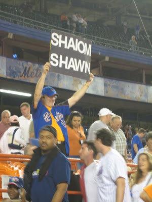
SHAlOM SHAWN

A big SHAlOM to lowercase L reader and Mets fan, EstoEric, who sent in this perfect example of lowercase L misuse, in transliterated Hebrew! EstoEric wrote:
From a recent Shea Stadium game; for Jewish player Shawn Green. Green hit a home run to win the game!

Judging from the size of the paper this fellow's carefully cut out letters are glued to, and the very tight kerning between the A and W in SHAWN, I'd say there was a slight miscalculation of how much space he had to work with.

I wonder if this L abomination was enough to turn EstoEric to the Yankees?

Friday, July 06, 2007

FREEDElEVRY


This is one of the most amusing examples lowercase L signage submitted I've seen in a while!  Found in front of a chinese restaurant in the ghetto of Syracuse, New York, by Eric K, it looks like the author misjudged both horizontal and vertical writing space. As he got closer to the bottom of the sign, looks like he panicked with "UNER", switch to a smaller size text with OWNERSHIP, and finally crammed FREE and DElEVRY together using every space-saving technique he could think of.

Yet another creative spelling of DELIVERY.

Monday, July 02, 2007

Yard SAlE


It must be a South Jersey thing. Visiting my family this past weekend in my hometown of Vineland, New Jersey, we went to the Red, White & Blueberry Festival in Hammonton, NJ, "Blueberry Capital of the World", on this warm first of July Sunday. Keeping my eyes peeled for a rogue BlUEBERRY sign, I shouldn't have been surprised to find this YARD SAlE sign before we even reached the festival grounds. It took me back to my youth, when I started noticing these lowercase SAlE L's in my rural surroundings. It also reminded me of why I left South New Jersey, fleeing up north to New York, where I thought I'd never come across another lowercase L again.

Interestingly, there were plenty of these green YARD SAlE signs leading up to the Blueberry Festival, some written as SAlE, others as SALE. Must have been two authors constructing the signs. Perhaps brothers ... one good, the other wicked.

Saturday, June 23, 2007

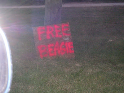
FREE BEAGlE

Submitted by Ryan And Nancy in South Bend, Indiana:
I have been driving by the attached sign on Portage Road in South Bend Indiana for a couple weeks. Before this there was a perpetual garage sale until a major rain storm, then everything was free...

Then this sad sign... no phone number, it is on the lot line between two houses.

As we drive past once again I point out the odd sign to my wife Nancy who took the picture...

'FREE BEASIE'?
'no that is a G.'
'Oh FREE BEAGIE. What is a beagie?'
'I think that is FREE BEAGlE, you know snoopy dog.'
'LOWER CASE L!!!!'
'What?"
"take a picture"
"Why?"
"take a picture"
click


Of course doing a google on beagie has many dogs with that name... so is this a dog looking for a new owner or is there a dog in jail somewhere?

This is the worst case of misspelling BEAGLE since Charlie Brown screwed it up in that spelling bee.

Sunday, June 17, 2007

SWAllOWED

"Skittles" submits this "eerie" lakeside epitaph and explains,
This was taken by the Michigan Lake where signs of "Danger: Shallow Water" and "No Swimming" were all around.

I wonder if Nathan David Weiss would find comfort in the fact that double lowercase L's written within otherwise entirely uppercase words is a fairly common occurrence, and is not nearly as confusing as a single lowercase L.

I also like the lowercase T's that look like plus signs ... BU+ NO+

Sunday, June 10, 2007

Reduced PlANTS


Kerrie in Lubbock, Texas submits this fine flora faux pas, the second wilted PlANT in a week! Kerrie writes:
Attached is a camera phone pic I took at my local Wal-Mart Supercenter (Lubbock, TX). Ironically, I took it on Friday, June 8, which looks like the same day you posted the sign on the 'Not for SAle' plant. Must have been a red letter lowercase 'l' day for plants - ha. Hope you enjoy it.

Reduced PlANT, indeed! With the L reduced to the lower case, looking so much like "piants", I was expecting 3.14 ants to be crawling around in the parking lot.

Friday, June 08, 2007

PlANT


As I waited in the checkout lane at the Key Food grocery store on 7th Ave. here in Park Slope, Brooklyn, I was disappointed by the concoction of upper and lowercase letters as written on the potted plant, which read "Not ForSAle". Not because I wanted to buy the plant, but because it was just another reminder that lowercase L freaks are slowly taking over the world. Admittedly, this example strays from the rules for a proper lowercase L event, because the "e" following the lowercase L in SAle is also lower case. But since all the upper and lowercase letters were written as the same size, and the lowercase L follows two uppercase letters, the sign is mildly confusing.

The plant that was "Not For SAle" ... priceless.

Monday, June 04, 2007

BlOG of Note

While still away on business in lONDON, I am pleased to have learned that lowercase L has been named the Blogs of Note blog for Monday, June 04, 2007! Blogs of Note, which is an official Blogger product, posts a daily list of "Interesting and noteworthy Blogger-powered blogs, compiled by the Blogger Team."

THANK YOU, BlOGGER!

Wednesday, May 16, 2007

American IDOl

With the American Idol season finale approaching, you couldn't ask for a more topical lowercase L sighting than this one. Spinning Girl took this snapshot of misguided BlAKE Lewis fans cheering their Idol on television. In Spinning Girl's words,
Even the cultural behemoth of American Idol isn't immune to Lowercase L syndrome --- look at tonight's show! (May 1) Contestants cheering for Idol contestant Blake (BlAKE) hold up signs confirming that bad singing isn't the only craze sweeping the nation!!!
Could this be a sign that things are looking BlEAK for BlAKE?

Sunday, May 13, 2007

Spring ClEANING


Springtime is here, and that means it's time for a good spring cleaning. Local cleaning services are capitalizing on this seasonal sanitization, and here in Park Slope you'll find bulletin boards littered with advertisements to help you with your chores.

It's odd enough when one ClEANING service uses a lowercase L within all uppercase letters to describe his business. But what are the chances that two competing services would commit the same fallacy? Before I let these chumps clean my apartment, I suggest they first clean up their act.

Tuesday, May 01, 2007

CHIlES y CHOCOlATE

Last night I ate at the new CHIlES & CHOCOlATE Oaxacan Kitchen here in Park Slope on 7th Ave. at Lincoln Place. The food was very tasty, but the menu board writing was hasty. I'll give the author a break for making the lowercase L slightly taller than the adjacent i in CHIlES, and for writing the adjacent A lower in CHOCOlATE. But what follows is no WElCOME sign. Man, that WElCOME is just distracting! And regarding the SCAllOPS, friend and fellow blogger Lilit complained that the double lowercase L's look like the writer forgot to dash an H in SCAHOPS.

While I may still eat here again, I will never truly feel 100% welcome.

Sunday, April 29, 2007

¡PlEASE!

The PlEASE in this sign found on the bathroom door at Café Viva on the Upper West Side of Manhattan isn't as confusing as others on this blog, but it's still no excuse for using a lowercase L when an uppercase L clearly would have made more sense.

Wednesday, April 18, 2007

Half Off SAlE

There's a Starbucks at every corner, but this broken wooden block letter SAlE sign is a rare treat. The lower leg of the capital L broke in just the right place to make it look like an uppercase i.

Funny story, as I was taking this photo outside the Starbucks on 7th Ave. here in Park Slope, Brooklyn, a young employee came rushing out, waving his hand in front of my camera, "Sir, you can't take photos of the store!" I thought he was joking, but he wasn't. Even after I pointed out that I was on a public sidewalk and could take a photo of anything I saw, he insisted that it was store policy to not allow photos inside or outside Starbucks. It was a slow day, so I told him to prove this obscure policy to me. He went inside to get the manager while I waited outside. When he came back out, sans manager, he scowled, "The manager is too busy, it's your lucky day."

It was my lucky day ... My first wooden lowercase L block letter!

Monday, March 26, 2007

KIll Your Timid Notion

Most instances of improper lowercase L usage occur in offline, in the real world. That is why we should celebrate Dale B. and her find on the Kill Your Timid Notion 2007 website for the underground music and film festival in Scotland. If you visit the site and click on the Flash navigation arrows, you'll find the Timetable page with a most peculiar end paragraph (shown above). The use of double lowercase L's is astounding! I'll let the word "All" pass, because it is not at All confusing. But GAllERY and INSTAllATIONS are double trouble, and TAlKS has me speechless. Dale describes the ordeal as "A strange paragraph, visually speaking, but an amazing festival."

Wednesday, March 21, 2007

Pear-l

I want to thank Rich Magahiz for submitting one of the most perfect examples of confusing lowercase L use I have seen in a while. Found in Bergenfield, NJ, 59 cents per pound for BARTlET pears is a great price, assuming you haven't already lost your appetite at the sight of this grocer's inclusion of an illegal lowercase L.

In his e-mail, Richard also posed the question, "I am wondering why someone hasn't made a lowercase i site, for signs where all the letters are capitals, but there's a dot over each I." Well, photos of lowercase i's might make for a fun blog, but the reason we do not focus on that anomaly is because, even though the use of lowercase i's within all uppercase letters is an odd writing style, it is not confusing to read. The lowercase i cannot be mistaken for any other letter, unlike the lowercase L, which can look like an uppercase i, or even the number 1.

Tuesday, March 20, 2007

Key to lUNCH

If you're looking for a good deal on good eats in Brooklyn, now's the time to Dine in Brooklyn for Restaurant Week, when participating restaurants are offering lunch and dinner on a prix fixe menu of just $21.12.

But if you are looking for consistency and clarity when it comes to the letter L, this is not the week for you. Today I received the Spring issue of Best of Brooklyn, a newsletter from our Borough President, Marty Markowitz. I happen to be a fan of Marty, and I'm sure the following lowercase L offense did not happen under his watchful eye.

Take a look at the key to dining in Brooklyn. It is very simple, with an orange uppercase D for Dinner, and a green uppercase L for Lunch:

The key: Green Uppercase L = Serving Lunch

All the restaurant listings stick to the key in the printed edition, until you get to Bermuda Restaurant:

lowercase L for Lunch at Bermuda?

What happened here? As I perused the restaurant listings, I got to this entry and wondered what green uppercase "i" stood for. Did it stand for "inexpensive"? Does it mean lunch is half off? Looks like ships aren't the only thing that go missing in Bermuda. So do the bottoms of uppercase L's.

Friday, March 16, 2007

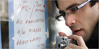
SlOW News Day

Photo by Michael Nagle for The New York Times

I never thought I'd see the day when my quest to understand lowercase L dysfunction would be taken seriously, especially by a reputable publication. But that day has come, my friends. If you can get your hands on The New York Times from the Sunday edition for March 11, you will find "A FlAW HE CAN’T OVERlOOK" in the City section!

Two weeks ago I had the pleasure of being interviewed by Emily Brady, the lovely New York Times journalist who had been assigned to my story. We spent the morning chatting about the lowercase L blog, how I got started, and where it's going. A few days later I was visited by photographer Michael Nagel, who went out with me on a lowercase L hunt. I explained that I usually do not go hunting for the L—rather, the L finds me. Luckily, we managed to find two fine examples within just a half hour on that frigid day.

The article begins:
Two summers ago, a computer consultant and cartoonist named William Levin was strolling down Seventh Avenue in Park Slope when the window of Jackrabbit Sports caught his eye. Above a display of shoes was a sign advertising marathon and triathlon training programs. An individual with an untrained eye might not have given the sign a second glance. But to Mr. Levin, the chubby capital letters contained a serious flaw.

You can read the rest of the article at the New York Times online.

Special thanks to journalist friend Paul Berger for recommending the story to The Times!

Monday, March 05, 2007

HATZOlAH

"HATZOlAH" is Hebrew for "rescue" or "relief", which is quite appropriate for this fine first example of a transliterated misplaced lowercase L! It concerns me that, in the unlikely event of an emergency at the Young Israel shul on the Upper West Side of Manhattan, confused congregants may see this as the phone number for "Hatzoiah" and not call. I could have corrected the sign with a pen, but that would have gone against the lowercase L Prime Directive, which "forbids any effort to improve or change in any way the natural course of such a society, even if that change is well-intentioned and kept completely secret." Also it was Shabbat, and writing is prohibited on Shabbat. (I did come back after Shabbat to take the photo, but I forgot a pen, and even if I had a pen, remember: Prime Directive)

Besides the lowercase L offense, look at the bigger picture. "WHATS HAPPENING?" with this bulletin board? It's missing the apostrophe in "WHATS", that's what's happening! And for some strange reason, the uppercase I is dotted, as if it may have been confused for a lowercase L, even though it was fine without the dot. Maybe that dot was supposed to be the apostrophe in WHATS.

Tuesday, February 27, 2007

Second DElIVERY Attempt

A few months ago I discovered this DElIVERARY note here on 7th Avenue in Park Slope, Brooklyn, arguably one of the best and most bizarre examples of lowercase L misuse to appear on this blog. Well, the author of the original note has struck again, and it looks like old handwriting habits are hard to break. If Avi writes his own signs, at least he has learned how to spell DElIVERY correctly since his last note. But, unfortunately, he still hasn't realized just how inappropriate it is to place a lowercase L next to all uppercase letters, especially an uppercase i. I'm willing to give him the benefit of the doubt, though, if it turns out his name is really AVL KRAVLTZ.

Sunday, February 25, 2007

ClOSED? C'mon!

The store owner who wrote this sign apologizes for the inconvenience they may have caused us by relocating their business around the corner, but he failed to apologize for the inconvenience of being confused by lowercase L's written to look like uppercase i's. This store on 7th Avenue here in Park Slope ClOSED in November, but opened a can of lowercase L worms in the process. It even looks like the uppercase L in PLACE was an afterthought, a feable attempt to squeeze in the L's base after it had already been written in the lower case.

And I may be off topic here, but "C'MON"! Is that really a left parenthesis to encompass "Mon, Tues, Wed Nov 6, 7, 8"? Because that parenthesis looks exactly like the C in ClOSED. Also, if it is supposed to be a left parenthesis, then the author is missing a final right parenthesis after "(6, 7, 8)", leaving the outer parentheses unClOSED.

I don't think I'll be venturing around the corner to see what they have in store.