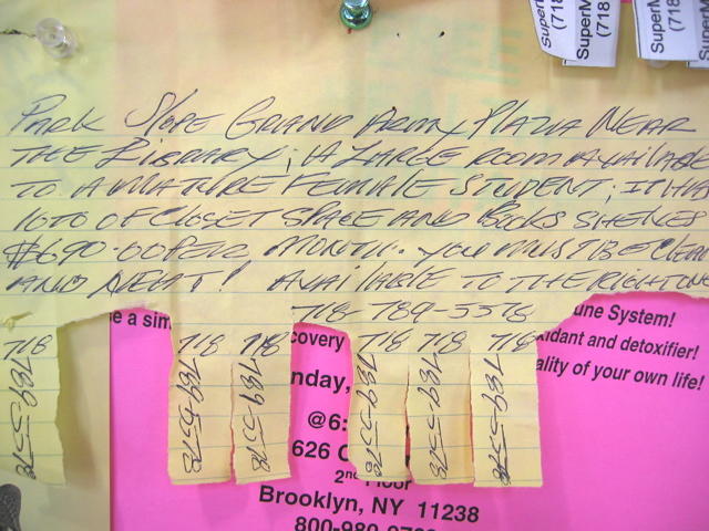
I like this Park Slope, Brooklyn posting found in Key Foods on 7th Ave. because the author uses an interesting combination of upper and lowercase L's, and lowercase i's. The logic behind the lettering style is clear: uppercase L for the first letter of a word, (e.g. LARGE, with exception of lOTS), lowercase L for succeeding letters in a word, (e.g. SlOPE, FEMAlE), and the stylish twist of using only lowercase i's (LiBRARY, AVAilABLE). There is some method to the madness here, since the lowercase i negates any confusion that could have resulted by mixing uppercase i with lowercase L. But why use lowercase L in the first place? I suppose someone could call the author and ask ...
2 comments:
This is such an engaging style of writing! It's creative and makes the post more eye-catching. Seeing how people can make something ordinary stand out is always fun. Speaking of standing out, I recently decided to update my mattress and chose a spring mattress. It's been amazing – the support is fantastic, and I sleep so much better. I'd highly recommend a spring mattress if you want to upgrade your bed. It's one of the best decisions I've made for my comfort.
I really like how you connected creativity with everyday comfort, it makes the whole experience more relatable. Upgrading sleep essentials can truly make a big difference, and it’s not just about the mattress. Adding the right pillows can enhance support and make your sleep even more comfortable and refreshing.
Post a Comment